How to Create A Responsive Blog Layout :A step- by -step Guide.
Prabhakar kumar | 27 May ,2025
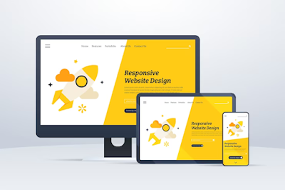
In today 's digital era , readers access blogs from a variety of devices - smartphones , tablets , laptops , and desktops . If your blog does not adapt to different screen sizes you may lose traffic and readers engagement on your blog . That's why a responsive blog layout is no longer optional , but essential for your blog setting .

In this article, " How to create A Responsive Blog Layout : A step - By - Step Guide " , you will learn how to create a responsive blog layout from scratch or optimize your existing one . Whether you are a new starter or a expert blogger , this article will help you to deliver a smoth , mobile friendly reading experience .
Table of Contents : -
[1] What is a Responsive Bolg layout ?
[2] Why is a Responsive Layout Matters .
[3] Step By Step Guide to Creating a Responsive blog layout :
[a] Step 1 -Choose a Responsive blog theme .
[b] Step 2 - Use a Mobile first design approach .
[c] Step 3 - Apply Flexible Grid Layouts .
[d] Step 4 - Make images and Media Responsive .
[e] Step 5- Use CSS Media Queries .
[f]
Step 6 - Optimize Navigation for all devices .
[g] Step7- Test your Blog on multiple Devices .
[h] Step8- Improve Loading Speed .
[i] Step 9- Use SEO best practices .
[4] Final Tips and Tools .
[5] Conclusion .
[1] What is a Responsive Blog Layout ? :-
A responsive layout is a blog design that automatically adjusts its structure , size , and elements [ like text , images , and menus ] to fit different screen sizes and devices -- such as desktops , tablets , and smartphones .
This means your blog looks good and easy to read and navigate no matter what device a visitor is using .
As for Example :
- On a computer , the blog may show a sidebar and multiple columns .
- On a mobile phone , the layout may change to a single column , stacking the content vertically for easy scrolling .
[2] Why a responsive Layout Matters ?
Responsive layout gives improved user experience . Readers can view and interact with your blog comfortably .
It helps in higher SEO rankings of blog . Google prioritizes mobile - friendly websites in search results .
It increases engagement period of readers on blog . Visitors are more likely to stay longer on responsive blogs .
It reduces bounce rate of readers on blog . If your blog looks good on any devices , users would not leave quickly .
[3] Step - by - Step Guide to Creating a Responsive Blog Layout :
Step-1- Choose a Responsive Blog Theme -
Start with a theme or template that is built to be responsive . If you are using platforms like Blogger , WordPress or Wix , search for mobile friendly or responsive templates . For selecting responsive layout , you should preview the theme on different devices and look for themes labeled as " mobile - responsive " or " SEO - friendly ".
Step -2- Use a Mobile - First Design Approach -
Design your layout starting from small screens and then scale up for larger screens . This approach ensures that your content is prioritzed and streamlined for mobile users .
Step -3- Apply Flexible Grid Layouts -
Use CSS Grid or Flexbox to build - width elements , instead , use percentage - based widths for containers and sections .
Example :
Css Copy Code
. container {
display : flex;
flex- wrap:wrap;
width : 100%
}
Step - 4- Make Images and Media Responsive -
Use the CSS property max - width : 100% to ensure images resize according to screen size .
Example :
Css Copy Code
img {
max - width : 100%
height : auto ;
}
Step-5- Use CSS Media Queries -
Media queries apply different styles based on screen width .
Example :
Css Copy code
@media [ max- width : 768px ]
{
. sidebar {
display : none ;
}
. content {
width : 100%
}
}
This hides the sidebar and expands the conent area on smaller screens .
Step -6- Optimize Navigation for All Devices -
Use a responsive menu [ like a hamburger menu on mobile ] that expands or collapses depending on screen size .
Tip : Use JavaScript or CSS frameworks like Bootstrap for easy responsive navigation .
Step -7- Test Tour Blog on Multiple Devices -
Use tools like :
- Google Mobile - Friendly Test .
- Chrome Dev Tools [ Device Mode ] .
- Responsinator.com
These tools show how your blog looks on various screen sizes .
Step -8- Improve Loading Speed -
A responsive layout should load fast . Optimize images , use lazy loading , and minimize CSS/ JavaScript Files.
Tools :
- Page Speed Insights .
- GTmetrix.
- TinyPNG [ for image compression].
Step -9- Use SEO Best Practices --
Ensure your layout supports :
- Mobile usability
- Fast loading .
- Readable fonts .
- Clickable elements [ CTA buttons]
- Proper heading structure [ H1 ,H2, H3 ]
[4] Final Tips and Tools -
Recommended Tools :
- Bootstrap - For building responsive layouts .
- Canva - For designing blog visuals .
- Google Fonts - For readable , web-friendly typography .
- WordPress Plugins : WP touch , Jetpack , or Elementor for responsive design.
[5] Conclusion :
Creating a responsive blog layout does not require expert coding skills - just smart design choices and modern tools . Start with a mobile - first theme , use flexible layouts , test across devices , and follow your blog performs beautifully and ranks well .
Responsive design = better user experience + higher search engine rankings .
------------------------------------------------------------------------------------------------------------------------------------------------------------------------------------------------------------------
FAQs. -1- What is a responsive blog layout ?
Ans -
A responsive blog layout is a web design that adjusts and looks good on all screen sizes -- desktops , tablets , and mobile devices .
Q-2- Why is a responsive layout important for my blog ?
Ans -
It improves user experience , boosts SEO rankings , increases mobile traffic , and reduces bounce rates .
Q-3- Do I need coding skills to create a responsive layout ?
Ans -
Not necessarily . You can use platforms like blogger , WordPress , or website builders with responsive themes . However , basic knowledge of HTML and CSS helps with customization .
Q-4- What are the key steps to creating a responsive blog layout ?
Ans -
- Choose a responsive theme / template
- Customize layout using HTML / CSS .
- Use flexible grids and images .
- Add media queries for screen adaptability .
- Test on various devices and browsers
Ans -
- Keep the layout simple and clean .
- Use flexible grids and fonts sizes .
- Minimize use of fixed width elements .
- Prioritize loading speed with compressed images .
- Use a mobile first approch .
Q-6- Can I customize the layout without coding ?
Ans -
Yes , most platforms offer drag - and - drop editors or built in layout customizers . But for more control , basic HTML and CSS knowledge helps .
----------------------------------------------------------------------------------------------------------------------------------------------------------------------------------------------------------------
Call -To - Action :-
Share it if you like it and comments on it .
Comments
Post a Comment
Name-
Email-
Mobile No-
Site Name -